TL;DR: Over the last 4 years, the BBC News core experience has been transformed from a speedy 21KB page into a slow & bloated 685KB monster. This was in part due to a lack of performance monitoring and 4 years of feature creep, but also due to a lack of performance-oriented culture throughout the business.
I created a lightweight prototype of the BBC News core experience which demonstrates that focusing on the content first and foremost can result in an extremely fast page. I want the BBC and other websites to rethink what the core experience means, and experiment with giving users the power to define their own experience.
In the beginning of 2012 the BBC Responsive News team wrote about how they provide a “core experience” for users by default, and then progressively enhance the page if the browser cuts the mustard. At the time, this was cutting edge. They were able to build pages that worked on practically any browser without compromising the experience for users on modern browsers. To quote directly from the Responsive News blog:
The first tier of support we call the core experience. This works on everything. I’ve seen it work on a Nokia E65, a Blackberry OS4, Kindle 1, a HTC Touch 2 running Win Mobile 6.5, a Samsung U900 Soul, a Commodore Vic20, my nan’s slipper and a toaster just sellotaped to a TV. Likewise, GoogleBot, text-browsers like Lynx, folks that disable JavaScript and so on are all assured a good level of service.
This technique is still in use today, and is an integral part of the front-end strategy for all modern BBC News pages. In 2012 it allowed the team to provide a fast and lightweight experience for users on low-end devices. 7 HTTP requests totalling 21KB was all it took to load the core experience of the BBC News front page. All users benefited from this fast initial page load, with modern browsers progressively enhancing the rest of the page after the content was loaded.
It has been over 4 years since the BBC News core experience was first built, and a lot has changed since then. Today, the core experience consists of 91 HTTP requests totalling 685KB – over 32x heavier than the original core experience. With JavaScript disabled this can be reduced to 137KB – still over 6x heavier.
The BBC News team is aware of their website’s shortcomings. Back in May 2015 I conducted a huge performance review which I’ve spoken about extensively both internally and externally (video). A lot of work has been done over the last year, and many of the issues mentioned in those slides have already been addressed. Despite this, the elephant in the room is still the core experience.
That’s why when BBC News ran an internal hack day (where people can form teams to work on whatever they like) I took the opportunity to totally redefine the BBC News core experience.
Why have a core experience?
If you’re not already convinced that having a core experience is a good idea, I’ll attempt to sell it to you now.
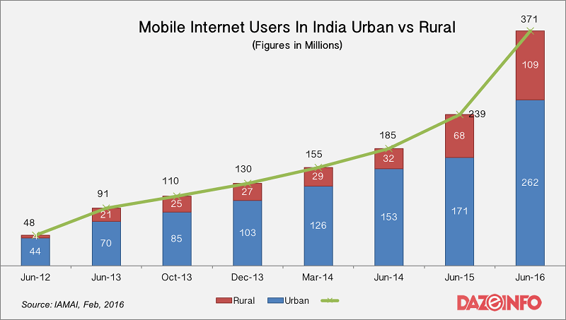
Of the 3.6 billion Internet users today, over 2 billion (65%) are accessing the web from developing countries. This percentage will continue to increase over the coming years, as Internet usage in developing countries is growing over 100x faster than the rest of the world. Yes, you read that right – 100x! In India alone, over 108 million people accessed the Internet for the first time in the last year. That was a 30% increase over the year before.

Despite huge Internet growth in developing countries, device capabilities and connection speeds are not improving. A typical smartphone sold in India in 2016 has 512MB of RAM, or about one sixth of a typical 2016 smartphone sold in developed countries. Fast connections are still a precious commodity, with nearly 70% of users in developing countries relying on cellular data to access the Internet. What’s interesting is that while this number is much lower in developed countries (10-20%), it has actually been increasing –not decreasing– over the last few years.
So what does all of this have to do with a core experience?
If the majority of your users access the Internet on a mobile connection, then (hopefully) the last thing you want to do is send them bytes they don’t need. Not only can this be costly for your users (it takes 17 hours of minimum wage work in India to purchase 500MB of mobile data), it can also be costly for your business. At BBC News, the difference between a page loading in 4 seconds versus the same page loading in 8 seconds correlates to a 30% increase in users abandoning the page. This is a big deal for content providers like the BBC, and an even bigger deal for online stores.
Providing a core experience is about being able to reach users all around the world, regardless of connection speed and device capabilities. It’s about thinking beyond the USA & Europe, and welcoming the other 65% of the Internet to your website.
The definition of a core experience
A core experience should be made up of these five things, in order of importance:
- The page content.
- The markup required to make the page accessible.
- Minimal styling to make the content easily readable – grids, typography, etc.
- Minimal styling to brand the page – logo, colours.
- The means to enhance the page where appropriate.
A core experience should be just these things. Everything else is an enhancement.
The way this has been achieved so far at the BBC has been to create a small core.css stylesheet containing just the styles for points 3 and 4. Then, provided the browser cuts the mustard, some JavaScript inserts an enhanced.css stylesheet into the page that contains the rest of the styling. This JavaScript is also responsible for downloading and initialising other JavaScript enhancements, like live updates and localisation services.
The problem with the BBC News core experience
Cutting the mustard to provide an enhanced experience is great from a web developer’s point of view: browsers that use enhanced.css can use modern (in browser terms) standards like CSS3. Likewise, modern JavaScript can be used without the need for polyfills or compatibility libraries. But there’s a problem with this approach: the user has no say in which experience they get.
The fact that a user has a modern browser does not mean that they have a fast or reliable connection. Providing a core experience is useless if users are going to be forced onto the enhanced experience anyway. Loading the enhanced BBC News front page on a mobile device will cost about 500KB. Opening an article page from there will cost another 370KB. That’s a cost of nearly 1MB of data (or 20 minutes of minimum wage work) just to read a single article.

As well as being relatively heavy, the BBC News core experience was designed with small screens in mind. The content is forced into a single column layout, and the width of the primary image is hard-coded to 200px. It looks fine on low-resolution smartphones and feature phones, but on anything larger it starts to look stretched and at the same time somewhat empty.
How did we get here?
The BBC is a relatively unique organisation in that its digital divisions don’t always act like a cohesive unit. The various digital “products” within the BBC (like News, Sport, and Weather) are developed independently and share very little in the way of code or overall vision. If you look closely at what makes up the BBC News core experience, you might notice that a large portion of the CSS, the JavaScript, and the images on the page come from BBC products that are not BBC News.
Most of these products live in the “white BBC bar” at the top of the page. This is an area of the page which used to have a very good core experience, but has become bloated over the last year or so in order to accommodate new features. When I look through the network requests of a core page load, there are three products that stand out from the crowd:
BBC iD
The ID service allows you to sign in so that you can do things like post comments and receive notifications. It adds 13 HTTP requests to the page –8 of which are scripts– totalling 25KB.

Notifications
The notifications service is the little bell icon at the top. When you’re signed in, it will notify you when your favourite TV shows and radio programmes are updated. Notifications adds 7 HTTP requests to the page, with a weight of 37KB. 2 of these requests are scripts, and 4 are individual SVG icons.
Clicking the icon results in another 2 requests being made, including a 47KB font.

Search
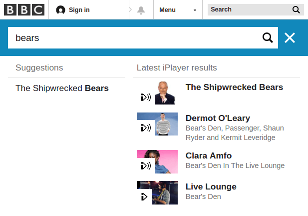
Search is the simple text input at the top-right of the page. Only, it’s not simple. When you start to type into the input, you’re presented with a lookahead-esque search interface. The BBC Search interface adds 4 HTTP requests to the page, totalling 14KB.
Beginning to type into the search input triggers app.min.js to be loaded in the page, weighing in at a hefty 86KB – or 320KB without compression! Furthermore, two HTTP requests at 4KB each are made on the (debounced) onchange event. Simply typing the word “bears” resulted in my browser making 10 additional requests totalling 43KB.

Perhaps I’m trivialising it, but the answer to how the core experience became so bloated really boils down to this: feature creep, and a lack of monitoring. 4 years ago we set the standard for performance on BBC News, but we never put the controls in place to ensure that the standard stayed the same. Without proper performance monitoring, the BBC News team were completely blind to the deterioration of the website’s performance. The standard has been slipping for years, and we didn’t even know.
I cannot stress enough how important monitoring is for performance. Good monitoring enables realistic performance budgets, which in turn enable automated warnings and performance alarms. Provided there is a good culture around performance, these things can be used as leverage to prioritise performance and user experience over features and deadlines.
Good performance monitoring needs to include both synthetic testing and real user monitoring. Today the BBC uses SpeedCurve to run over 22,000 synthetic performance tests each month. We mostly use these to provide a high-level “state of performance”, and to track whether releases have any affect on page performance. We have also previously used mPulse real user monitoring, which allowed us to get a much more detailed view of how our pages were performing in the real world.
Starting from scratch
Making a slow website fast again is really hard. Sometimes there are easy pickings, like removing unused styles and scripts. Usually though, the problems are like a metastatic cancer: they are spread out far and thin, and you can’t remove them without risking damage to the rest of the system.
That’s why earlier this week, I started thinking about how I would approach the core experience for BBC News if I were given the opportunity to build it from scratch. No overhead, no requirements, no third-party products on the page.
What I came up with was a hand-rolled CSS framework using Sass mixins from Bootstrap v4. This produces about 3.5KB of CSS (1.5KB gzipped), which is small enough to inline. It also enables the markup to be fairly concise, with very few extraneous elements. From a performance perspective, I think the prototype is a success:
- A 7KB HTML document containing all the core content and inlined styles – 80% smaller than the current 36KB core experience document.
- 3 HTTP requests totalling 39KB – 88 fewer requests and 95% fewer bytes.
- 100ms first paint time – 150ms faster (60%) than the current core experience.
- 460ms first paint time – 440ms faster (50%).
- A much better CPU profile.


While these metrics are interesting, the real proof is in how the prototype performs on a simulated 2G connection: the first paint time is 4.5 seconds, and it is fully loaded at 8.5 seconds. For comparison, the BBC News core experience has a first paint time of 19.5 seconds, and is fully loaded at 52 seconds.
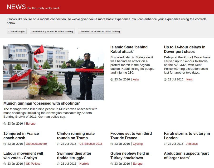
I think the prototype is also an improvement on the user experience. The layout is fully responsive and works at all device widths. It also supports responsive images through the use of srcset, with a sensible medium-quality src fallback.
Here is the finished product on a wide screen:

As well as creating a truly lightweight core experience, I also wanted to think about how we can put people back in control of their own web experience. We can give people a core experience when we think they need it –for example by detecting screen width or connection speed– and then give them the power to enhance the experience for themselves, should they want to.
I’ve started to explore these ideas by implementing two controls:
- A button that (lazily) loads the remaining images on the page. This requires basic JavaScript support, so can be used by most users.
- Buttons to prefetch article content. This requires a relatively modern browser with service worker support.
I think there’s certainly more to explore in this area, especially around minimising the amount of interaction required to receive the optimal or desired experience.
If you’d like to inspect it further, the code for this prototype is on GitHub, and a live demo is available at https://wildlyinaccurate.com/news-core-experience/.
Where to from here?
After all of that, the point I really want to make is this: for a website like BBC News, content is the only thing that matters.
With current trends, very soon the majority of Internet users will be browsing the web on a mobile connection. The lucky ones will have 3G-like speeds, and the others will be lucky to even get 2G-like speeds. As website producers, we need to make it easier for these people to get to the content that they want. By far, the easiest way for us to do that is to give them just the content. Nothing else.
BBC World Service is expanding to reach a wider audience by 2020, and most of the users in that audience will come from developing countries. This is a fantastic opportunity to reinvent the BBC’s web experience and tailor it for the users we have (people using underpowered phones on mobile connections), rather than the users we want (people using MacBooks on cable connections).
At BBC News we understand this, and we’re in the middle of building our front page from the ground up with performance at the front of our minds. We’re using the small & efficient Grandstand CSS framework developed by our colleagues in BBC Sport. We’re also investing in performance monitoring up-front, and trying to drive performance as a key feature rather then an afterthought.
With HTTPS everywhere being rolled out across the BBC later this year, the BBC’s web teams have a whole new set of opportunities before them. One of the things I’m most excited about is the ability to start using the service worker API to provide a better and more resilient web experience.
